
In today’s Digital World, users access websites from a dizzying array of devices: smartphones, tablets, laptops, desktops, and even smart TVs. If your website isn’t optimized to adapt seamlessly to every screen size, you’re likely losing traffic, conversions, and credibility. Enter *Responsive Web Design*—the gold standard for creating websites that look and function flawlessly, no matter the device. In this blog post, we’ll dive into what responsive design is, why it’s essential, and what actionable steps are needed to implement it effectively.
*What Is Responsive Web Design?*
Responsive web design (RWD) is an approach that ensures a website’s layout, images, and functionalities are automatically adjusted to fit the screen size and orientation of the device being used. Instead of building separate websites for desktop and mobile users, responsive design uses flexible grids, CSS media queries, and fluid images to create a single, universal experience.
The concept was popularized by Ethan Marcotte in 2010, and it’s built on three core principles:
1. *Fluid Grids*: Layouts are designed using relative units (like percentages) instead of fixed pixels.
2. *Flexible Images*: Images scale within their containers to avoid breaking the layout.
3. *Media Queries*: CSS rules that apply specific styles based on device characteristics (e.g., screen width).
*Why Responsive Design Is Non-Negotiable in 2024*
1. *Mobile Traffic Dominates*
Over 60% of global web traffic comes from mobile devices. If your site isn’t mobile-friendly, you’re alienating the majority of potential visitors.
2. *SEO Benefits*
Google prioritizes mobile-friendly websites in search rankings. Its “mobile-first indexing” means the search engine crawls and indexes the mobile version of your site first. A non-responsive site could tank your SEO efforts.
3. *Better User Experience (UX)*
A responsive site ensures smooth navigation, fast load times, and readable content across devices. Frustrated users quickly abandon sites that force them to pinch, zoom, or scroll horizontally.
4. *Cost Efficiency*
Maintaining a single responsive site is cheaper and easier than managing separate desktop and mobile versions.
5. *Future-Proofing*
New devices with varying screen sizes (like foldable phones) emerge constantly. A responsive design adapts to these changes without requiring a complete overhaul.
*How to Create a Responsive Website: Step-by-Step*
1. *Start with a Fluid Grid Layout*
Use CSS Grid or Flexbox to create flexible layouts. Replace fixed-width elements with percentages. For example:
CSS
.container {
width: 90%;
max-width: 1200px;
margin: 0 auto;
}
2. *Optimize Images for All Screens*
Ensure images scale proportionally by setting max-width: 100%; in CSS. Use modern formats like WebP for faster loading.
3. *Leverage Media Queries*
Define breakpoints (e.g., for tablets at 768px and smartphones at 480px) to adjust layouts:
CSS
@media (max-width: 768px) {
.menu {
display: none;
}
.mobile-menu-icon {
display: block;
}
}
4. *Adopt a Mobile-First Approach*
Design for the smallest screens first, then enhance layouts for larger devices. This ensures core content is accessible to all users.
5. *Test Extensively*
Use tools like Chrome DevTools, BrowserStack, or real devices to test your site across screen sizes. Check for issues like:
– Text readability (font sizes too small on mobile).
– Touch-friendly buttons (minimum 48x48px).
– Performance (slow load times on 3G networks).
6. *Prioritize Performance*
– Compress images and videos.
– Lazy-load offscreen content.
– Minimize CSS/JavaScript files.
*Best Practices for Responsive Design*
– *Simplify Navigation*: Use hamburger menus for mobile and prioritize key links.
– *Avoid Fixed-Width Elements*: Say no to rigid sidebars or oversized tables.
– *Use Responsive Typography*: Tools like vw (viewport width) units or clamp() in CSS help text scale smoothly.
– *Optimize for Touch*: Ensure buttons and links are spaced to prevent accidental clicks.
*Common Responsive Design Mistakes to Avoid*
1. *Ignoring Breakpoints*: Don’t assume one size fits all—test and refine for key device categories.
2. *Overloading with Content*: Trim non-essential elements on mobile to reduce clutter.
3. *Neglecting Performance*: A responsive site that’s slow defeats its purpose.
*Conclusion*
Responsive web design isn’t just a trend—it’s a necessity. By prioritizing flexibility, performance, and user-centric design, you’ll create a website that delights visitors, boosts SEO, and drives results. Whether you’re building a site from scratch or optimizing an existing one, start with responsiveness at the core.
*Ready to take the plunge?* If coding isn’t your forte, platforms like WordPress, Shopify, and Squarespace offer responsive templates. For custom solutions, partner with a web developer who specializes in RWD. Your audience (and Google) will thank you!
*FAQs About Responsive Web Design*
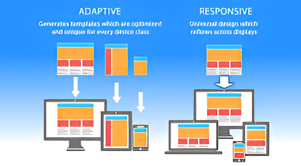
*Q: How is responsive design different from adaptive design?*
A: Responsive design uses fluid layouts to adapt to any screen, while adaptive design serves static layouts tailored to specific devices.
*Q: Can I make an existing website responsive?*
A: Yes! Audit your site’s code, update layouts with fluid grids, add media queries and optimize images.
*Q: What’s the ideal number of breakpoints?*
A: Focus on common device widths (e.g., 320px, 768px, 1024px) but let content—not devices—dictate breakpoints.
By embracing responsive design, you’re not just building a website—you’re crafting an experience that works for everyone, everywhere. 🌐✨


 English